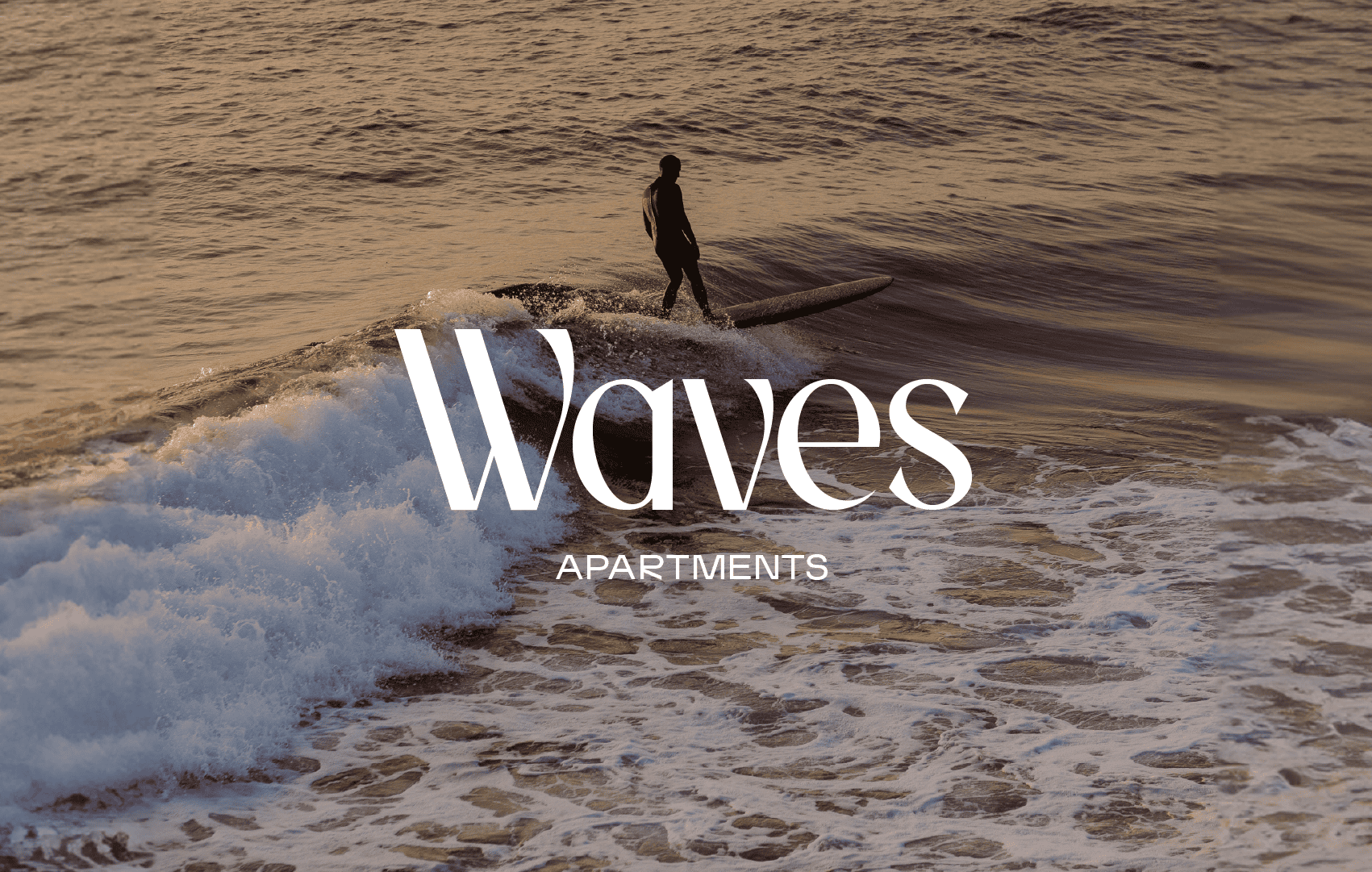
We pulled inspiration from the natural elements of Guernsey’s West Coast where Waves is located for the brand. For the wordmark, we selected a typeface with organic curves like the curl of a wave or marram grass blowing in the wind. The photography focuses on capturing the solitude of the location, curating scenes of how visitors might use the space - a morning planning a coastal walk, reading on your balcony or enjoying drinks after a day in the sun.

The website boasts a sleek, contemporary design that simplifies navigation and vividly displays the apartments, complete with availability details, information, and images; prioritising user-friendly functionality to craft a captivating online presence.
On social we rebranded profiles and pages, using bespoke photography and video to echo the modernised website and new brand. With new social ads, updated search campaigns and refreshed organic content, Waves’ digital content promotes its unique location, friendly operation and evolved style.
Client Testimonial ‘The re-brand and new website have been instrumental in updating Waves offering by improving the user experience and reducing barriers to book.’